
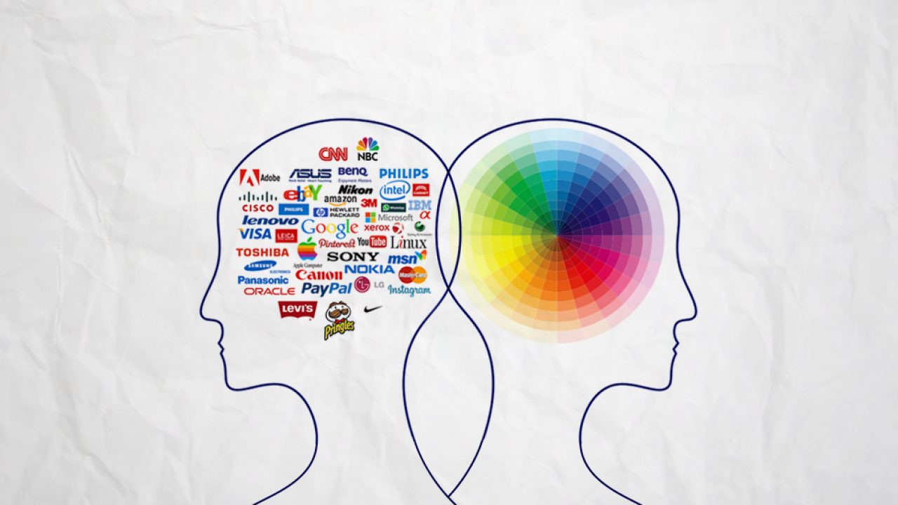
Introduction
Color is one of the most powerful design elements at your disposal. Before a single word is read or a detail is noticed, color creates the first emotional impression of your brand. The right color palette can evoke feelings of trust, excitement, luxury, or comfort—while the wrong colors might confuse or repel your target audience.
Understanding color psychology is essential for creating a cohesive brand identity that resonates with your customers. In this guide, we'll explore how different colors influence perception and provide strategies for selecting the perfect palette for your brand.
The Foundation: Color Theory Basics
Before diving into the psychology of specific colors, it's important to understand basic color theory. Colors exist in relationships on the color wheel, creating harmony through complementary, analogous, triadic, and other schemes.
Colors are also categorized by temperature. Warm colors—reds, oranges, and yellows—create energy and excitement. Cool colors—blues, greens, and purples—feel calm and serene. Neutral colors—blacks, whites, and grays—provide balance and sophistication. Most effective brand color palettes use a mix of these color families to create visual interest and emotional depth.
Red: Energy and Passion
Red is the most energetic color on the spectrum. It grabs attention, stimulates excitement, and creates a sense of urgency. Red is often associated with passion, power, and action. That's why it's so prevalent in industries where energy and attention are paramount—food and beverage (McDonald's, Coca-Cola), entertainment, and action-oriented brands.
However, red can also feel aggressive or alarming if overused. When incorporating red into your brand, consider what emotion you want to evoke. Are you trying to stimulate action? Create excitement? Or establish power and confidence? Use red strategically as an accent color rather than dominating your entire palette.
Blue: Trust and Stability
Blue is the color of trust, reliability, and professionalism. It's the most popular color choice for corporate and financial brands—think of IBM, Visa, and American Express. Blue also suggests calm and serenity, making it popular for healthcare and wellness brands.
Different shades of blue evoke different feelings. Navy blue feels sophisticated and authoritative, while light blue feels calm and friendly. Sky blue feels expansive and peaceful. When choosing your shade of blue, consider which characteristics you want to emphasize in your brand.
Yellow and Gold: Optimism and Value
Yellow is the color of happiness, optimism, and energy. It's used effectively by brands wanting to feel approachable and friendly. However, yellow can feel cheap or overly casual if not used carefully. Gold, on the other hand, feels premium, luxurious, and valuable.
Yellow works well as an accent color or highlight, while gold is often used in luxury branding. Both can help your brand feel positive and valuable—the context determines which works best for your specific brand personality.
Green: Growth and Nature
Green symbolizes growth, renewal, health, and nature. It's increasingly popular among eco-conscious and wellness brands. Green also feels balanced and harmonious, suggesting stability and natural goodness.
Different shades create different associations. Forest green feels sophisticated and natural, while lime green feels vibrant and modern. Sage green feels calming and organic. When incorporating green, ensure it aligns with your brand's values and positioning.
Purple: Creativity and Luxury
Purple has historically been associated with royalty, luxury, and creativity. It's less common in branding, which makes it distinctive when used effectively. Purple feels imaginative, wise, and sometimes spiritual. Lighter purples feel more playful, while deeper purples feel more luxurious and mysterious.
Brands targeting creative industries, premium positioning, or audiences valuing individuality often incorporate purple. It's a bold choice that can help differentiate your brand from competitors.
Orange: Friendliness and Enthusiasm
Orange combines the energy of red with the warmth of yellow, creating a feeling of friendliness and enthusiasm. It's approachable without being aggressive, energetic without being overpowering. Brands wanting to feel welcoming and fun often use orange.
Orange works particularly well for brands in tech, sports, and entertainment where you want to feel energetic and accessible. It has an inherently youthful quality that can help brands feel modern and forward-thinking.
Black and White: Contrast and Elegance
Black represents sophistication, power, elegance, and sometimes mystery. Used strategically, black conveys luxury and exclusivity. White represents purity, simplicity, and cleanliness. The combination of black and white creates maximum contrast and visual impact.
Luxury brands often use black with touches of gold or white. Tech brands frequently use minimal black and white palettes to convey simplicity and sophistication. When using black and white, ensure sufficient contrast to maintain legibility while creating the desired emotional tone.
Gray: Neutrality and Balance
Gray is the ultimate neutral color. It suggests balance, professionalism, and timelessness. While gray alone might feel boring, when paired with other colors, it provides a sophisticated foundation that lets your secondary colors shine.
Many successful brands use gray as their primary neutral, pairing it with vibrant accent colors or complementary neutrals for interest and impact.
Pink: Warmth and Femininity
Pink carries associations with warmth, compassion, and creativity. While historically marketed toward feminine audiences, modern brands use pink across diverse sectors when they want to convey friendliness, approachability, or creativity. Different shades create vastly different associations—hot pink feels vibrant and bold, while soft pink feels gentle and nurturing.
Building Your Brand Color Palette
When selecting your brand colors, start with understanding your brand personality and target audience. What feelings do you want to evoke? What competitors are you differentiating from? How will your colors function across digital and print applications?
Most effective brand palettes include a primary color, secondary colors, and neutrals. The primary color should dominate and be immediately recognizable. Secondary colors add interest and flexibility, while neutrals provide balance and legibility.
Test your color combinations across different media. Consider how your colors look on screens, printed materials, and merchandise. Ensure sufficient contrast for accessibility and readability. Create specific guidelines for your color palette—exact hex codes, RGB values, and Pantone numbers—to maintain consistency across all brand applications.
Cultural Considerations
Color meanings vary across cultures. While red symbolizes luck in China, it might represent danger in Western contexts. Before finalizing your global brand palette, research how your colors are perceived in your target markets. This is especially important for brands expanding internationally.
Conclusion
Color psychology is both a science and an art. While research shows general color associations, ultimately your brand's color palette should feel authentic and aligned with your brand personality. The best color palette for your brand is one that resonates with your target audience, differentiates you from competitors, and feels true to your brand's values and mission.
Take time to explore different color combinations. Test them with your target audience. Refine based on feedback. Remember that your color palette will likely evolve as your brand grows, but the foundational colors should remain consistent and recognizable for years to come. That's the power of thoughtful color psychology in branding.